
Product information
This article guides you through the process of adding, editing, or removing information on your product pages. Providing accurate, reliable, and comprehensive product details empowers customers to make informed purchasing choices.
How to add a Product information section?
Steps
- In the theme editor (Customize), open the template selector.
- Select Products, then Default product.
- On the left-sidebar, add Product information.
- Make necessary changes > Save.
How to customize your Product information section
General Settings
| Setting | Description |
|---|---|
| Section width | Controls the width behavior of the section container: |
| Show breadcrumb | Displays the breadcrumb navigation. |
| Enable sticky content on desktop | Keeps the product content fixed in position while scrolling on desktop devices. |
Media
Learn more about media types.
| Setting | Description |
|---|---|
| Desktop media width | Controls the media width on desktop devices: |
| Desktop media position | Controls the media position on desktop layouts: |
| Desktop layout | Controls the product media layout on desktop: |
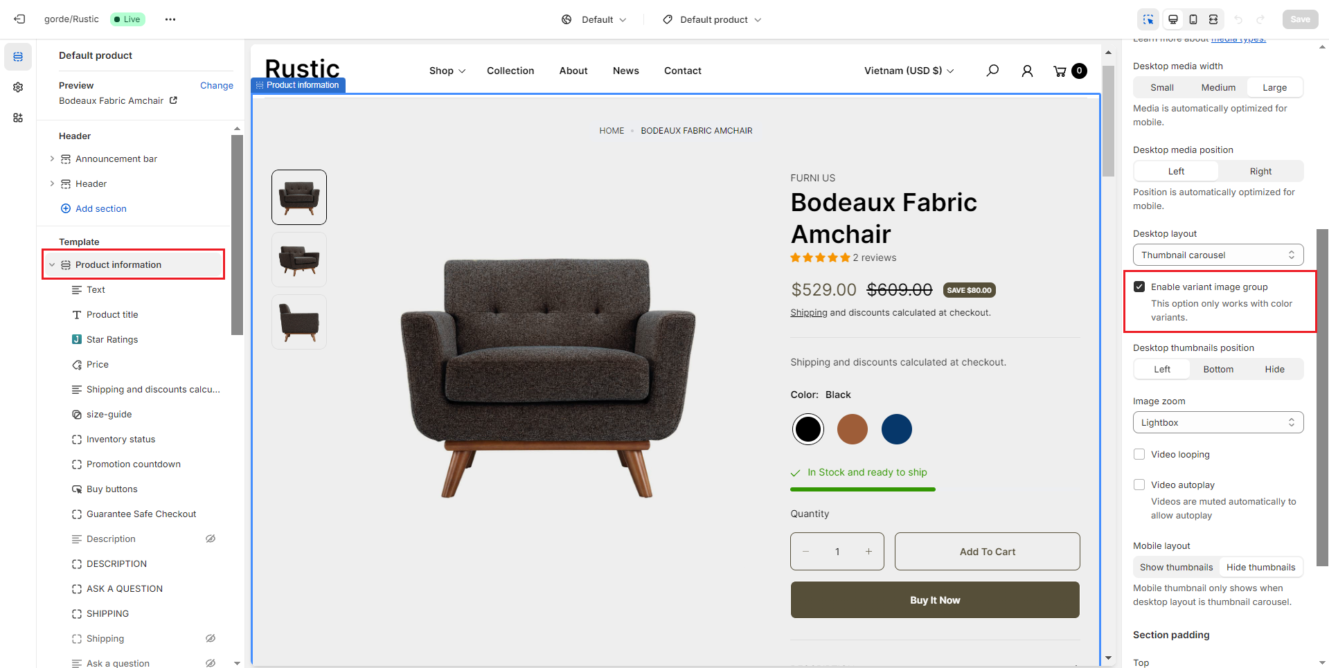
| Enable variant image group | Displays only the images associated with the currently selected product variant. |
| Desktop thumbnails position | Controls the thumbnail position on desktop layouts: |
| Image zoom | Controls the product image zoom behavior: |
| Enable video looping | Loops product videos continuously when enabled. |
| Enable video autoplay | Automatically plays product videos when enabled. |
| Mobile layout | Controls thumbnail visibility on mobile devices: |
How to set up Variant image group
Step 1: Choose the product you want to set up Variant image group. Select an image that you uploaded for the product.
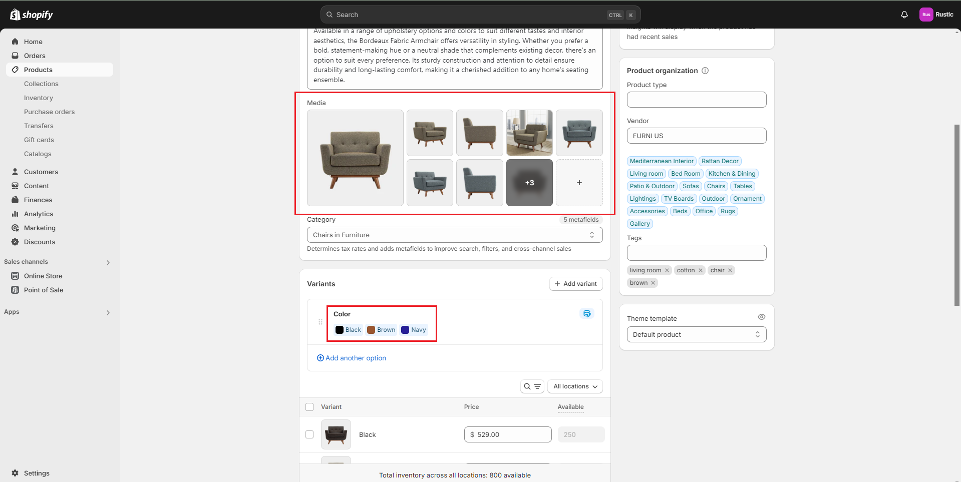
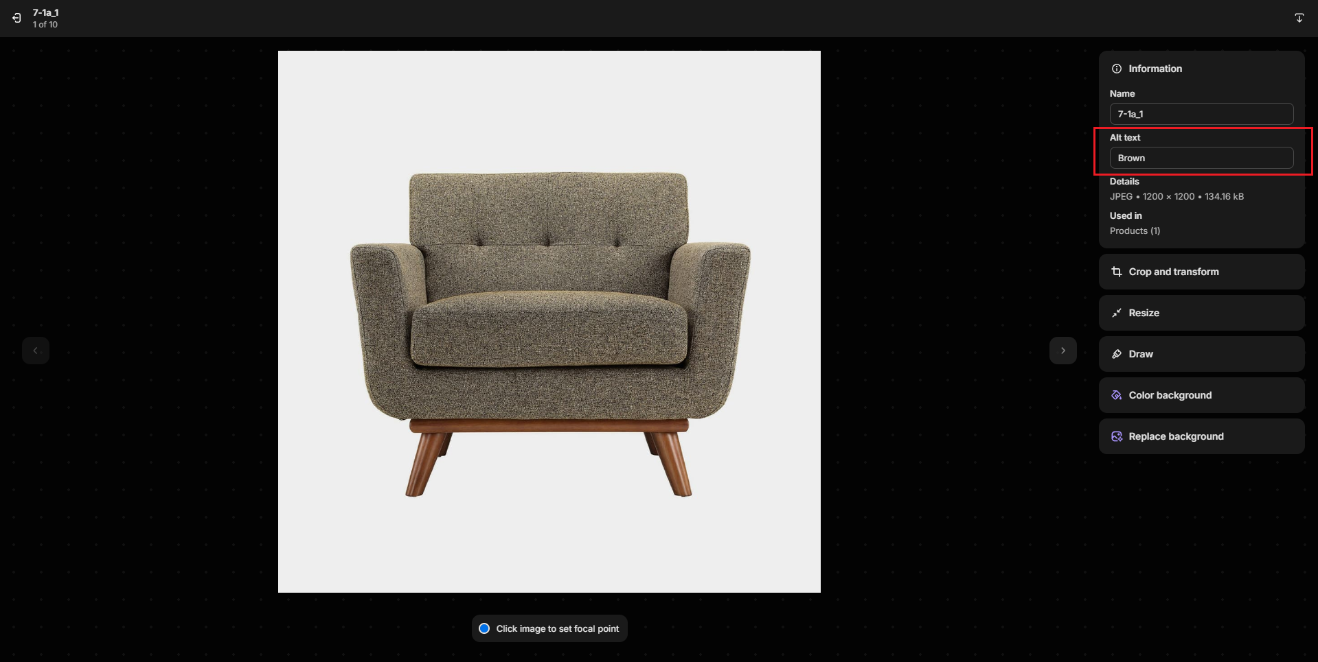
Step 2: Fill the Alt text with the corresponding variant
Step 3: Enable Variant image group on the product page.
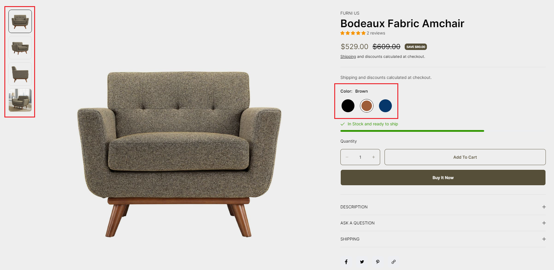
Step 4: Experience the Variant Image group in your store.
Section padding
- Top padding: Customize the top margin of the section
- Bottom padding: Customize the bottom margin of the section
Block settings
1. Text
Add the custom content you want
2. Product title
Display product title
3. Price
Display product price
- Show sale badge: Display product badges such as discounts, out of stock, in stock, and more
4. Product rating
Display the product's rating
5. Buy buttons
- Show dynamic checkout buttons: Toggle the ''Show dynamic checkout buttons" option to include a direct checkout button
- Show recipient information form for gift card: Enables users to schedule gift card deliveries with personal messages. Learn more
6. Variant picker
Products with variants provide customers with more choices. To learn more about variants and how to add them to your store, visit the following link .
.png)
- Type : Pills and Dropdown
- Show size chart: Display size chart
- Size chart label: Title of size chart
- Size chart page: Select the page to display the size chart you've created
- Custom size chart Using specific size charts for each collection or product. To use a custom size charts for product or collection, create metafield with namespace and key: "custom.size_chart". Learn more .
7. Collapsible row
Add a heading and extra information on the tabs.
.png)
- Heading: Include a heading that explains the content.
- Row content: The content, as you've written
- Row content from page: The content is get from the selected page
8. Pop-up
.png)
- Link label: Content link
- Icon: Selected icon display
- Page: Selected page will display content
9. Share
The option to display social networks for sharing or copying links to share.
.png)
10. Custom liquid
Add app snippets or other Liquid code to create advanced customizations.
.png)
11. Complementary products
To select complementary products, add the Search & Discovery app. Learn more
.png)
12. Promotion
Display the promotion countdown.
You need to create a metafield before displaying this block. Please see how to create a metafield here
.png)
13. Description
Display the product description.
.png)
14. Ask a question
Display a form for users to submit questions to the seller about the product.
.png)
15. Trust seal
Upload the image you want
.png)
16. Product meta
Show/hide collections, SKU, product type, and product tags.
.png)
17. Inventory status
Inventory status signifies the availability of a product. It's vital for ensuring products are in stock, managing inventory efficiently, and informing customers about availability on your website
.png)
18. Divider
Creates a straight line with customizable colors.
.png)
No comments yet